Our home reveal: featuring all things LIGHTING!
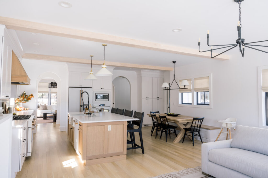
Lighting is an art form. Something that I really didn’t anticipate when building our home. And that is when I decided to bring in the professional to help over here. I called Arielle who is a fabulous designer and close friend of mine. Arielle came in and helped us tremendously with furniture selection and layout, lighting, paint/stain colors, styling, and really put the finishing touches on our home.
Picking out lighting though is an actual beast. I wasn’t overwhelmed doing the other parts of the home until we had to pick out fixtures. Then I learned how there are SO many options. You have sconces, chandeliers, pendants and so on. And each room really needs to flow nicely together. So while the lighting above our built-ins may be in a different room and area of the home than our office and Mezcal room, it all comes together when you look at our home in its entirety. Arielle is incredibly close to products from what seems like every manufacturer out there. She really understood where to invest and where to scrimp so that we could stay on budget but achieve the vibe we were going for throughout.
Now for the kween herself – Arielle – to give us the full scoop on all things lighting in our home!
Hi family! As Rachel mentioned, I am an interior designer living and working in nearby Short Hills, and I’m so excited for us to finally reveal the design for her beautiful new home, starting with my all time favorite category. Last year, when I moved into my first house after a lifetime of apartment living, I was also about to have our first baby. So, even though I LIVE for this stuff, I wanted to start with a very limited scope of work and just cross off the necessities- to me that was a masterpiece of a nursery and a completely new lighting plan. Naturally, lighting was the first aspect of the project I began sourcing with Rachel, since I came a little later to the party and the architectural plans were already complete by the time her builder introduced us. As you can see, her home is flooded with natural light, and would act as the perfect backdrop for lighting to carry the eye through a subtle, monochromatic color scheme. They don’t call it the jewelry of the house for nothing! As soon as the fixtures began getting installed, for me that was when it really began to feel less like a construction site and more like a home (for Rachel it was probably when her appliances arrived).
Let’s run through our lighting choices:
1. Dining table + Island lights
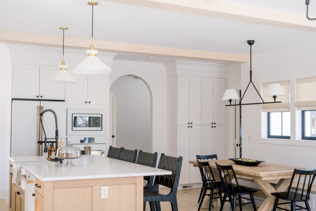
The heart of Rachel’s home is obviously going to be her kitchen, which is open to her primary eating and family gathering space. There are six fixtures in close proximity, so they really had to meld well together, but still hold their own visually by segregating the dining area from the island from the lounge. The plan also features a wall of windows that peer over the balcony into the backyard, so it was valuable to us to ensure lighting would not feel too heavy in the room or obstruct the gorgeous view.
The pendants over the island feature a cream shade and intricate knurled brass that references the pulls on the built-ins by the fireplace. They are understated but thoughtfully tie adjacent details together. Nearby, a linear chandelier hangs over the white oak dining table. It’s softer linen shades reference the cone shape of the pendants, without feeling redundant. I love this piece because of the handmade nature of the iron work. It adds a subtle texture that feels artisanal and rich. Details like this really elevate the look and feel of lighting, which is ideal for such an important focal point.
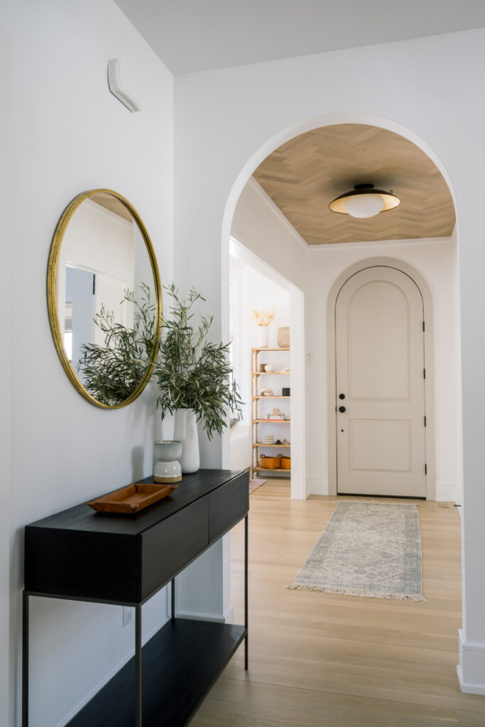
The ceiling in the front entrance is a herringbone wonder, and the flushmount there is the first thing to greet you when you walk in the dramatically arched front door. The gold leaf in this mod fixture bounces light off the ceiling and walls and feels welcoming! with an exclamation point. The form is clean and bold and doesn’t detract from the wood pattern above. We love it so much we installed a second one in the foyer. Consider repeating a fixture when you have a gracious entrance and an elongated hall or landing following it, or if a collection offers a flushmount and a pendant that play off of each other. It’s an easy way to build some continuity first thing and keeps the lighting plan from getting too busy.
3. Above the built in + Family room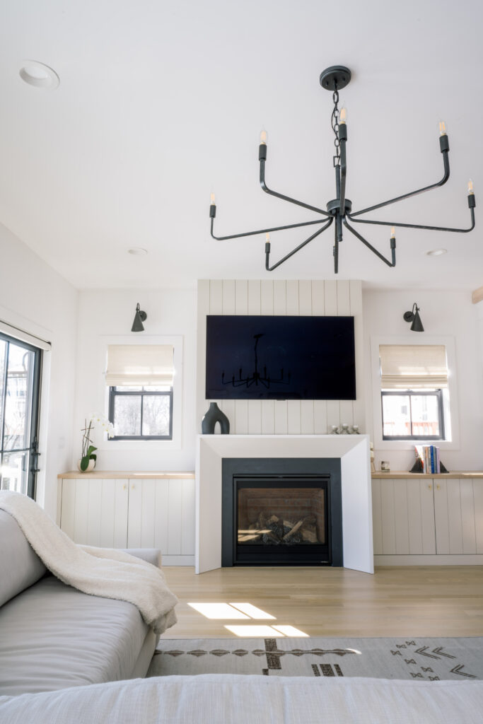
The largest chandelier coming in a 46” in diameter branches over the sectional, but feels weightless thanks to delicate arms and the negative space between them. This is a great example of a wallet-friendly fixture that serves up a lot of look on a budget at around $500. While this chandelier is very on trend with “Modern Farmhouse” decor, the elegantly tapered bronze sconces that overlook each window beside the fireplace bring a sense of originality and uniqueness back to the space.
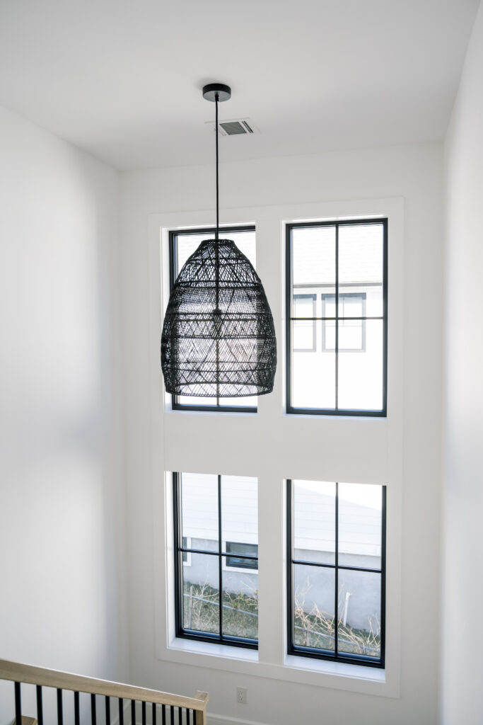
Ah this stairwell. It’s basically on the sun in the best way possible. Rachel had originally set her mind on a similar basket pendant from RH, but it felt really overpriced for what it was and we were already pushing the limits of our budget. I countersourced this guy from Serena and Lily and I love both the singularity and scale of the pendant against the double height window wall, as well as how the light passes through the wicker and adds texture to an otherwise very clean space. When dressing a stairwell, keep in mind how the lighting will look from all angles. The perfect piece should be as compelling from below as at eye level.
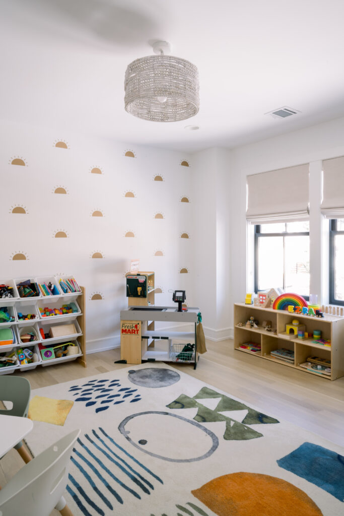
Did I mention the budget yet? Because it’s a real thing, people. Everything adds up when you’re building a house. Things you never thought you would fork over thousands of dollars for, like doorknobs, just show up on your invoice to ruin your life. But they’re critical and then other line items like the lighting in your kids’ playroom suffers. Right? No, it doesn’t have to. This cutie was affordable and let me just say, it was the right size and price with adorable whitewashed wooden beads strung in an irregular wave pattern. What a triumph over dragging yourself to Home Depot and hanging up whatever chrome and glass fishbowl is in the sale section. I guess what I’m trying to impress is that every room, every detail is an opportunity to consider the elements of design and how they contribute to telling the overall story of your home. And the playroom was not exempt from our design vernacular, nor should it have been. You have to get creative in order to balance your books, something Rachel is really great at and while I consider myself very scrappy, this one took our bargain-hunting abilities to a new level.
7. Primary fan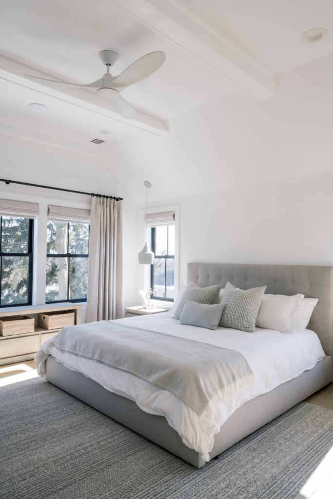
When your client wants a ceiling fan in their Premiere bedroom and the designer wants to make it disappear. I jest! This is a great fan and was a little bit more of a splurge compared to some of the other choices, but it kept up appearances with the white pendants Rachel already owned from their condo, and has a strong enough motor to actually circulate air so they might save a bit on their utility bill this summer.
8. Primary bathroom vanity + Primary bathroom pendant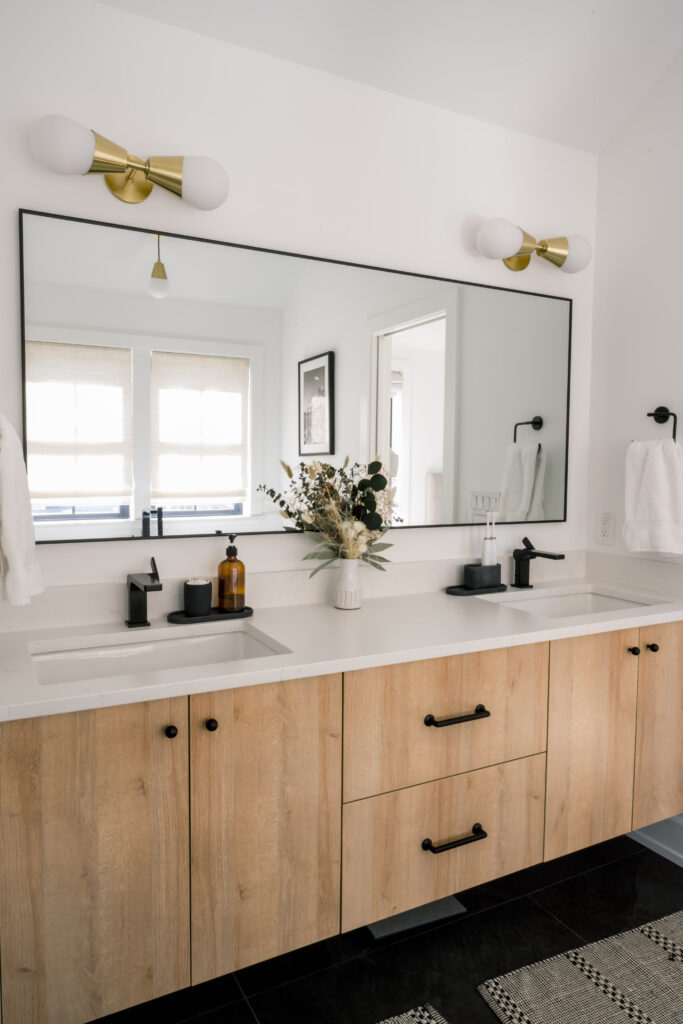
Let’s be honest, this is Ez’s and B’s bathroom. That said, if you follow Rachel on Instagram (of course you do!) you haven’t missed her gushing about her favorite moisturizer or vitamins from her bathroom mirror, head wrapped in a towel. One of my favorite qualities about Rachel is how approachable she is. It’s her authentic personality in real life, and as an interior designer, it’s integral to my design ethos to capture my client’s nature and identity in their homes. The premiere en-suite is laid back and informal with it’s custom floating vanity and rustic hardware. It seems to call the whole family to come hang out and brush their teeth together. The brass lighting adds just a touch of modernity and glam, because even though Rachel would rather live her life in matching sweats, she is one of the most effortlessly chic people I know who is not French.
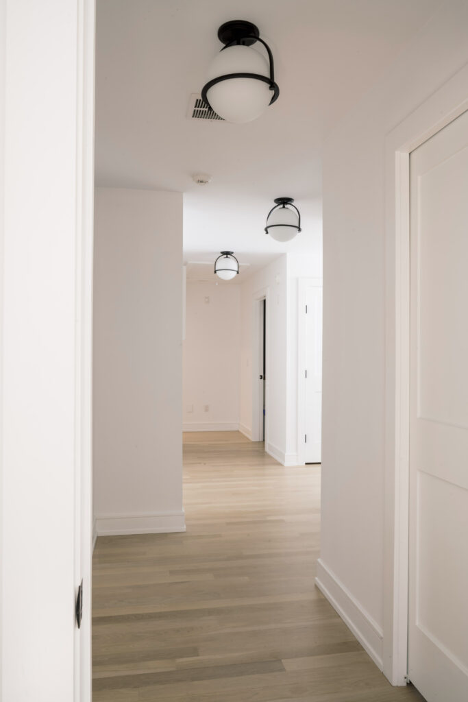
A tried and true way to fake a little ceiling height upstairs is to bring the lighting just a touch lower than you might expect. We dotted the hallway with these simple globe fixtures with black accents, which nod confidently to the black basket swinging over the stairs. They hang just low enough to draw the eye upwards without knocking Jordan out when he walks underneath them.
10. Office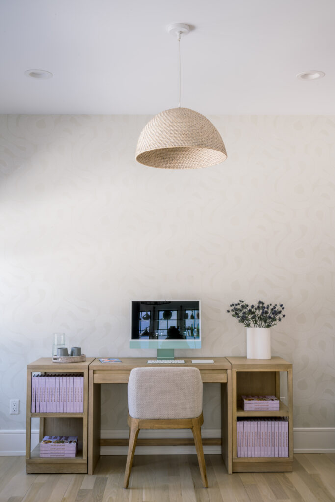
It looks like our piece de resistance, the Mezcal Tasting Room is waiting for a future reveal… so I’ll say for now that this office is one of my favorite rooms in the house! The neutral woven pendant from Ethan Allen was a clearance item that I thought played so well with the movement in the tonal wallpaper installed on the wall behind it. My vision for this space was always to feature stacks of Rachel’s cookbook, “Just The Good Stuff”, which has a beautiful lavender spine. I aimed to create a zen like work atmosphere that really showcases her achievements, especially her book, that would also serve as an ideal environment to shoot all of her work (read- all the cookies you love so much). I think the simple nature of this pendant really accomplishes that.
You’ll notice many of the choices we made throughout Rachel’s home are single light fixtures installed in rooms bathed in natural light and/or with additional recessed lighting. Many times, this allowed us to make choices that were inexpensive or based on form over function. When considering your own lighting plan, pay careful attention to the natural light your room receives at different times of day, especially those times you expect to utilize the space the most. Work backwards from the additional lumens needed to illuminate the room or integral work surfaces so that you don’t wind up in love with a light that can’t brighten your day.
While many design schemes can be executed in phases, I don’t believe lighting to be one of them. Pull the trigger (with a licensed electrician) on a complete plan that makes sense and do it all at once. This could mean directional task lighting, sconces, lighting within cabinetry, floor and table lamps, or adding recessed lights. If all else fails- update lighting with smart switches and dimmers to cultivate different moods.
Thanks for reading friends! xo, Arielle
